Rebranding reflects school values, sparks controversy
Sparking praise, criticism, and intense student reactions, Westminster’s new branding movement has caused many heated debates since its announcement on April 19.
Roughly 18 months ago, the Board of Trustees along with the Westminster administration decided that the school needed a massive public rebranding. According to president Keith Evans, three simple realities motivated the decision.
“[Firstly,] the school had not gone through any branding exercise for years and years. Every great organization and every great school periodically goes through a way that they think about how they’re communicating who they are and what they’re up to,” said Evans. “Then, they update their image. [Secondly,] we had a lot of different expressions of the brand around campus, a variety of colors being used, different athletic symbols, et cetera. There was a need to consolidate and get some direction. [Thirdly,] there was a desire for a new, modern way to express the story of the school.”
Thus, the rebranding process began as project-specific focus groups formed and teamed up with local marketing organization, Mindpower, who has helped notable institutions such as Tulane University. This search for a genuine representation revolved around the public’s perception of the school.
“You want to understand both the ways that the people understand the school’s strengths and then also some things that they might say, which make you think, ‘That’s not who Westminster is,’” said Evans.
Then, the branding strategists interviewed various members of the significant Westminster community, such as students, alumni, faculty, parents, leadership, friends, grandparents, and the extended community, such as prospective families, former faculty, and college admissions officers, in search for the common attributes used to describe and distinguish Westminster. As time passed, the creative team noticed a reoccurrence of a few key themes associated with Westminster.
According to the school website, “Westminster extends Christian love to all. Our students are nurtured by challenge. Wildcats lead with their hearts and minds. They have the power to change the world.”
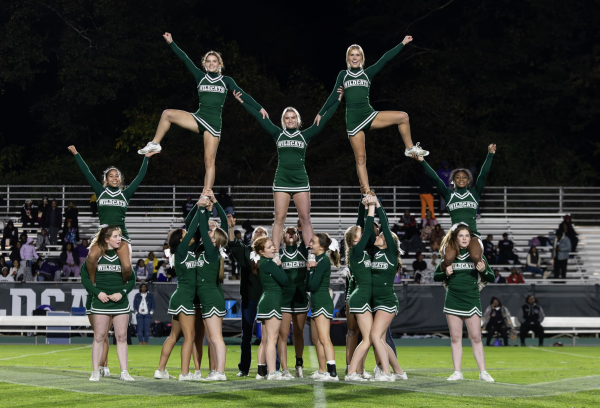
The community understands these themes now through four simple words: love, challenge, lead, and change. After the showcase of the first phases of the branding reform, the administration revealed the second and final phase of the rebranding movement: the logo change. While the traditional Westminster school seal remains useful for formal occasions such as religious services and graduation, the combination of the pursuit for school-wide modernization and the difficulty in translating the seal digitally inspired the school’s decision to transform the primary logo entirely. Thus, rather than the seal, three simple, similar logos currently describe the Westminster community. The dominant logo of the school emerges as a simple “W,” with the inner ends of each “V” within the “W” intersecting. The secondary logo reflects the same “W” in a “brighter, fresher spring green” background. The final logo depicts a circle of these “W”s, which symbolizes the unity in the school community. Additionally, the administration announced the decision to terminate the use of “the Westminster Schools,” except for in legal documents, and instead use simply “Westminster.”
Students began to question the motives of the drastic change almost immediately.
“Did anyone even pause to think of asking an art student or an art teacher?” said senior Beth Huang.
Many in the community also believe that there was a lack of cohesive communication from the administration.
“I have never heard a faculty member, student, or parent complain about the current state branding, so what was the reason?” said junior Sterling Ralph.
The motive for this transformation revolves around the concept of unity across the Westminster community. Across all branches of the school, athletics, arts, and academics, and across all branches of the community, students, alumni, faculty, parents, Westminster serves as one unified family. Therefore, our standardized “W” logo and the singular name, “Westminster,” should reflect this unity.
Yet, despite the positive intentions, many members of the Westminster community, students, alumni, faculty, and parents, view this rebranding negatively and perceive the change as disrespectful to the 65-year-old tradition and excellence of Westminster.
“We did this for the sake of doing it, and that really annoys me,” said Ralph. “The fact that students and parents were not even consulted just makes this worse, and the absolutely awful execution just adds insult to injury.”
The debate of the new color scheme also troubles many.
“I feel like the new logo and the new lime green color are stepping away from the beloved traditions of Westminster, such as the dark green and the seal,” said freshman Evie Rearden. “The lime green and new logo do not represent Westminster.”
Sophomore Phoebe Liu criticized the hypocrisy of the rebranding.
“I understand that we are using the new logo in addition to the old one to have a ‘better’ and more modern digital presence, but I believe the new logo, although in line with modern minimalist graphic design, does quite the opposite: it causes Westminster to blend in with the masses and have a confused, two-sided identity,” said Liu.
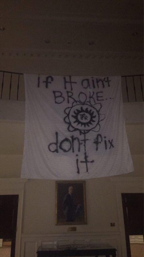
A petition created by ‘15 alumna Afton Yildirim, on May 4, titled #SaveOurSeal, has spread through student, parent, and alumni social media circles and has racked up more than 2,500 signatures. The petition gained 1,000 of those signatures within the first 24 hours of its creation. Many are anticipating the administration’s next move.